The Dashboard shows you a live view of the pulse of your business:
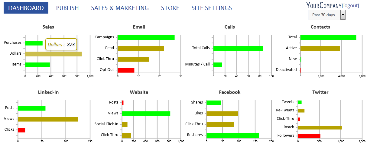
- The SIZE of each bar changes to show your performance
- The color shows performance against your plan
- Green is above average
- Yellow means caution
- Red is below average
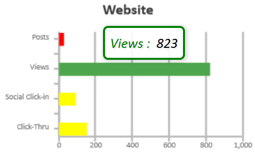
- Mousing over a bar shows you detail
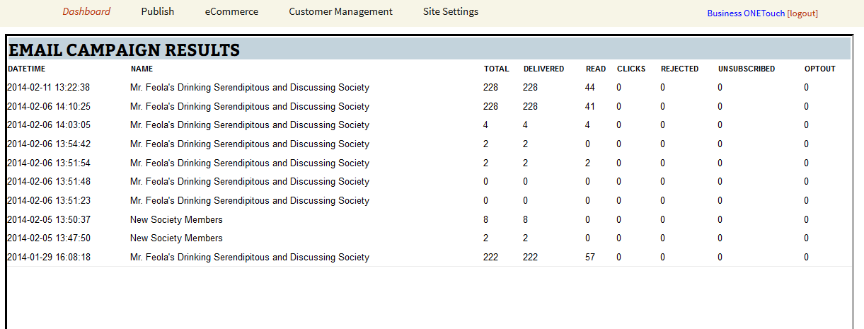
 And clicking on any graph takes you into the detailed view of the data: